Graphy
The AI-powered data visualization platform that transforms complex data into stunning, interactive charts and graphs in seconds, making data storytelling accessible to everyone.
What is Graphy?
Graphy is an AI-powered data visualization platform that revolutionizes how teams present and communicate data. By transforming complex datasets into stunning, interactive visualizations in seconds, it makes data storytelling accessible to everyone—not just data scientists or designers.
Founded with the mission to democratize data visualization, Graphy serves over 50,000 users from data-driven teams worldwide. The platform combines artificial intelligence with intuitive design principles to help professionals create graphs that don't just display data, but tell compelling stories that drive decisions.
What sets Graphy apart is its focus on speed and simplicity without sacrificing quality. Users report creating professional-grade visualizations 80% faster than with traditional tools, turning what once took hours into a matter of minutes. The AI doesn't just generate charts—it provides insights and suggestions to help you present your data in the most impactful way possible.
Transform Data into Visual Stories
Our Rating
Tool Information
- Category: Data Visualization
- Starting Price: $12/month
- Free Trial: Free Plan Available
- Platform: Web-based
- Best For: Data Teams & Marketers
Our Verdict
Graphy excels at making data visualization fast and beautiful. Its AI-powered insights and intuitive interface make it perfect for teams who need to create impactful charts without design expertise.
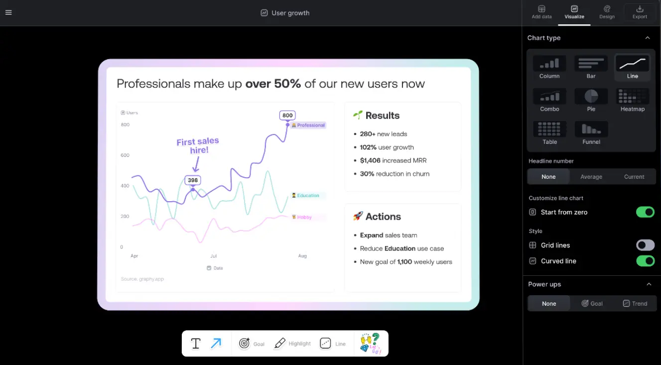
How Graphy Works
Graphy's simplicity is its superpower. The platform operates on a straightforward principle: paste your data, let AI analyze it, and get beautiful visualizations instantly. No steep learning curve, no complex configurations—just immediate results.
The Process: Start by inputting your data through copy-paste from any source, direct Google Sheets integration, or manual entry. Graphy's AI immediately scans your data to understand patterns, relationships, and key insights. Within seconds, it generates multiple visualization options optimized for your specific dataset.
AI Intelligence: The platform's AI doesn't just create generic charts. It analyzes your data structure and suggests the most effective visualization types—whether that's a line graph for trends, bar charts for comparisons, or more complex visualizations for multidimensional data.
Customization & Polish: Once generated, every aspect of your visualization is customizable. Add annotations to highlight key insights, apply your brand colors, adjust styles, and use one-click enhancements like trend lines or goal markers. The result? Professional visualizations that look like they took hours to create.
Key Features Deep Dive
Lightning-Fast Creation
Create professional graphs 80% faster than traditional tools with AI-powered automation and smart templates.
AI-Generated Insights
Automatically discover patterns and trends in your data with AI that suggests the best ways to visualize your information.
One-Click Enhancements
Add trend lines, goals, annotations, and other visual elements instantly to make your data tell a clearer story.
Seamless Integrations
Connect with Google Sheets for live data updates and embed charts in Notion, Slack, presentations, and more.
Real-Time Collaboration
Work together on visualizations with team members, share interactive links, and collaborate seamlessly.
Brand Customization
Apply your brand colors, fonts, and styles to maintain consistency across all your data visualizations.
Graphy Pricing Plans
Free Plan
- Unlimited viewers
- Basic chart creation
- Share anywhere
- Graphy watermark
Plus Plan
- Everything in Free
- Remove watermark
- Brand colors
- Unlimited AI features
Business Plan
- Everything in Plus
- Priority support
- Advanced analytics
- Custom integrations
Pros & Cons
Pros
- ✓ Incredibly fast graph creation - 80% faster than alternatives
- ✓ No learning curve - intuitive interface anyone can use
- ✓ AI-powered insights help discover data patterns automatically
- ✓ Beautiful, professional designs without design skills
- ✓ Generous free plan for individual users
Cons
- × Limited advanced customization for power users
- × Focused on charts/graphs, not full infographics
- × Team collaboration requires paid plans
- × Limited export formats compared to traditional BI tools
Best Use Cases for Graphy
Marketing Teams: Create stunning visualizations for campaign reports, social media analytics, and performance dashboards. Graphy's speed is perfect for weekly reporting cycles and client presentations.
Startups & Small Businesses: Transform pitch deck data into compelling visuals that impress investors. The professional quality without the enterprise price tag makes it ideal for bootstrapped teams.
Data Analysts: While not replacing full BI tools, Graphy excels at quickly creating shareable visualizations for stakeholder communication and rapid insights sharing.
Content Creators: Turn research data into engaging visuals for blog posts, newsletters, and social media. The embed functionality makes it perfect for digital content.
Consultants: Rapidly generate client-ready visualizations during meetings or for reports. The ability to maintain brand consistency across clients is particularly valuable.
Frequently Asked Questions
Is Graphy suitable for complex data analysis?
Graphy excels at visualization rather than deep analysis. It's perfect for presenting insights and creating beautiful charts quickly, but for complex statistical analysis, you'd still need dedicated BI tools. Think of Graphy as your presentation layer that makes data accessible and engaging.
Can I use Graphy charts in my presentations?
Absolutely! Graphy charts can be exported as PNG, SVG, or PDF files, or embedded as interactive elements in presentations. They work seamlessly with PowerPoint, Google Slides, Notion, and other presentation tools. The high resolution ensures they look crisp on any screen.
How does Graphy compare to Excel or Google Sheets charts?
Graphy is significantly faster and produces more visually appealing results than spreadsheet charts. While Excel/Sheets are great for data manipulation, Graphy specializes in presentation-ready visualizations. Users report saving hours per week by using Graphy for their chart creation needs.
Try Graphy Now
- ✓ Free plan available
- ✓ No credit card required
- ✓ 80% faster than alternatives
- ✓ AI-powered insights
Tool Specifications
- Category
- Data Visualization
- Platform
- Web-based
- Free Plan
- Yes
- Starting Price
- $12/month
- Website
- graphy.app
Why Trust Our Review
- 🧪 Hands-on testing experience
- 📊 Real performance metrics
- 👥 User feedback analysis
- 🔄 Regular review updates
🏆 Final Verdict
Graphy stands out as the fastest, most intuitive data visualization tool available. While it may not replace enterprise BI solutions, it excels at its core mission: making beautiful, insightful charts accessible to everyone. Perfect for teams who value speed and aesthetics.
Ready to Transform Your Data?
Join 50,000+ professionals using Graphy to create stunning visualizations in seconds.
No credit card required • Create unlimited graphs
Gamma
AI-powered presentation maker that creates beautiful slides, documents, and webpages in seconds
Napkin AI
Transform text into visual diagrams, flowcharts, and infographics with AI-powered design
Plus AI
AI assistant for Google Slides and PowerPoint that creates and edits presentations instantly