Napkin AI
Transform text into professional diagrams, charts & infographics instantly. AI-powered visual storytelling tool with generous free plan—perfect for business presentations & content creation. Serving 5+ million users with 500 weekly free credits and unlimited visual editing.
30-Second Summary
Bottom Line: Napkin AI revolutionizes visual content creation with its text-first approach that requires zero design skills. The generous free forever plan with 500 weekly credits makes professional diagram creation accessible to everyone. However, mobile functionality remains limited, and it's not designed for complex data visualization tasks.
Best For
- Business professionals creating presentations
- Educators and corporate trainers
- Content creators needing shareable infographics
- Consultants building client frameworks
Skip If
- Need complex data chart visualization
- Require mobile-first workflow
- Need advanced design tool features
- Want numerical dataset integration
Napkin AI at a Glance
What Exactly is Napkin AI?
Napkin AI represents a paradigm shift in visual communication, transforming the traditionally complex process of creating professional diagrams, charts, and infographics into a simple, AI-powered workflow that requires nothing more than plain text input.
This innovative platform was born from the frustration experienced by its founders, Jerome Scholler and Pramod Sharma, the visionary creators behind the successful AI gaming company Osmo. The platform has achieved remarkable growth, reaching over 5 million registered users as of August 2025. Growing from 2 million to its current user base in just months, Napkin AI has generated $1.7M in annual revenue with a lean 15-person team in 2025.
Traditional Design Tools vs Napkin AI
Manual Design Approach
- Start with blank canvas requiring design skills
- Manually arrange shapes, connectors, and text
- Spend hours on layout and formatting
- Navigate complex design interfaces
- Expensive software subscriptions required
With Napkin AI
- Start by simply pasting or writing text
- AI automatically generates multiple visual options
- Professional results in seconds, not hours
- Document editor interface—familiar and simple
- Free forever plan with 500 weekly credits
The Text-First Revolution
What distinguishes Napkin AI from traditional design tools is its text-first approach combined with powerful editing capabilities. Users don't need to start with blank canvases or navigate complex design interfaces. Instead, they simply paste their existing content or write new text, click the spark icon, and watch as AI generates contextually relevant visuals.
How It Works Behind the Scenes
The platform operates on the principle that effective communication through visuals shouldn't require design expertise or expensive software. Napkin AI's sophisticated artificial intelligence engine analyzes text content to understand key concepts, relationships, and data points, then automatically generates multiple visual representation options including diagrams, flowcharts, infographics, mind maps, and business frameworks.
How Does Napkin AI Actually Work?
Creating visuals with Napkin AI is refreshingly simple—no complex prompts needed. The entire process revolves around a natural text-first workflow that feels like using a document editor with superpowers. Here's how it transforms your ideas into professional visuals.
No-Prompt Visual Generation
✅ What Napkin Handles Excellently
- Instant visual generation: Click spark icon—no prompts required
- Context understanding: AI analyzes text to identify relationships and concepts
- Multiple format options: Generates flowcharts, mind maps, diagrams instantly
- Full editability: Customize colors, icons, layouts after generation
- Dynamic adaptation: Visuals scale automatically with content changes
⚠️ Current Limitations
- Mobile limitations: Full features work best on desktop
- Data visualization: Doesn't generate charts from numerical datasets
- Weekly credit caps: Free plan limited to 500 credits weekly
- Advanced design: Less customization than professional tools
- AI refinement: Generated visuals may occasionally need adjustments
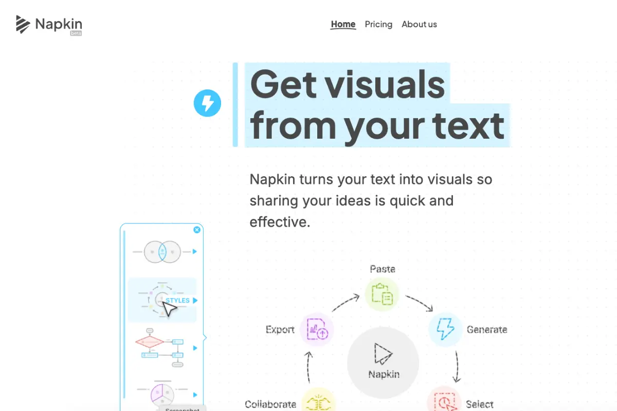
The Four-Step Creation Process
Write or Paste Your Text
Start by typing directly in Napkin's document editor or paste existing content. The platform works with any text—from meeting notes to complex business strategies. There's no special formatting required; just write naturally as you would in any document.
Tip: You can paste content from emails, reports, or notes—Napkin understands natural language.
Click the Spark Icon
The magic happens when you click the spark icon next to any paragraph or section. Napkin's AI instantly analyzes your content, understanding context, relationships, and key concepts. Within seconds, it generates multiple visual options perfectly matched to your content. Custom generation (launched June 2025) lets you specify exact visual types.
Tip: Try generating from different paragraphs to see various visual interpretations of your content.
Choose and Customize
Select from the AI-generated options—whether it's a flowchart, mind map, or infographic. Every visual is fully editable. Change colors, swap icons from their extensive database, adjust layouts, or modify text. The dynamic connectors adapt automatically as you make changes.
Tip: The elastic design system means visuals automatically scale when you add or remove elements.
Export and Share
What sets Napkin apart is how visuals live alongside your text. Export individual visuals or complete documents with integrated text and graphics, perfect for reports and presentations. Multiple format options include PNG, SVG, PDF, and PowerPoint.
Tip: Real-time collaboration features let teams work together on visual documents simultaneously.
Core Features That Define Napkin AI
🤖 No-Prompt AI Generation
EffortlessSimply click the spark icon—no complex prompts needed. AI automatically understands your content and generates relevant visuals instantly. The sophisticated natural language processing analyzes context, relationships, and key concepts to create multiple visual options within seconds.
🎯 Custom Generation
June 2025Specify exact visual types including flowcharts, mind maps, tables, and timelines. Control orientation (portrait, landscape, square), set detail levels from summary to detailed views, and directly select visual types during generation for precise results matching your exact needs.
🎨 Fully Editable Visuals
CustomizableCustomize colors, fonts, icons, and layouts after generation. Swap from comprehensive icon database and adjust styles with dynamic connectors. Every element is editable through an intuitive visual editor that requires no design expertise.
🔄 Elastic Design System
AdaptiveVisuals automatically scale with content changes. Support for unlimited elements without manual adjustments. Text changes instantly reflect in visuals without regeneration, with dynamic connectors that adapt automatically to maintain professional appearance.
📝 Document Integration
UnifiedWorks like a document editor with native visual generation. Write, generate, and edit text and visuals seamlessly together in one unified workspace. No jumping between tools or applications—everything happens in a familiar document-style interface.
📱 Mobile App Support
2025 LaunchiOS app launched in March 2025 (available on Apple App Store) with Android companion apps also available. Mobile viewing and basic editing now supported, though desktop remains optimal for full feature access and complex visual creation.
🤝 Real-Time Collaboration
Team FeaturesMultiple team members can edit simultaneously with built-in commenting, highlighting, and feedback tools. Real-time synchronization ensures everyone sees changes instantly, making team collaboration seamless and productive.
📊 Multiple Visual Formats
VersatileGenerates flowcharts, mind maps, business frameworks, infographics, and diagrams based on content context. AI automatically selects the most appropriate format for your content, or you can specify exact types with custom generation.
💾 Flexible Export Options
UniversalExport as PNG, SVG, PDF, or PPT. Share complete documents with integrated text and graphics. Unlimited PNG/PDF exports even on the free plan ensure you can use your visuals anywhere without restrictions.
Napkin AI Pricing: Generous Free Forever Plan
| Plan | Monthly Price | Key Features | Best For |
|---|---|---|---|
| Free Forever | $0 | 500 weekly AI credits, unlimited editing, unlimited PNG/PDF exports | Individual users, testing |
| Plus | $9/month | 10,000 monthly credits, remove branding, priority support, advanced templates | Regular users, professionals |
| Pro | $22/month | 30,000 monthly credits, exclusive styles, unlimited custom styles, premium support | Power users, teams |
Is Napkin AI Worth The Cost?
Traditional Approach
- Canva Pro: $12.99/month per user
- Adobe Express: $9.99/month
- Lucidchart: $7.95+/month
- Design time: 2-4 hours per visual
- Total: $30-50+/month with time investment
Napkin AI All-in-One
- Free plan: 500 credits weekly
- Plus: $9/month unlimited editing
- Pro: $22/month advanced features
- Creation time: Seconds, not hours
- Total: $0-22/month with 90% time savings
Verdict: Free plan is genuinely usable for regular needs with 500 weekly credits. Paid plans offer exceptional value compared to multiple design tool subscriptions, especially considering the time savings from instant AI generation.
Understanding Credit Usage
Credits are consumed when generating visuals—editing existing visuals is unlimited on all plans. Here's what the credit allocations mean in practice:
- Free Plan (500 weekly): Approximately 10-15 visuals per week, perfect for regular but not heavy usage
- Plus (10,000 monthly): Around 200+ visuals per month, suitable for professionals creating content regularly
- Pro (30,000 monthly): 600+ visuals per month, ideal for teams and agencies with high volume needs
Honest Assessment: Pros and Cons
What Works Exceptionally Well
- Generous free forever plan 500 weekly AI credits with unlimited visual editing and PNG/PDF exports make professional diagram creation genuinely accessible without payment
- Zero learning curve Text-first approach with instant generation eliminates need for design skills. Click spark icon and get professional results immediately
- Professional-quality output AI-generated diagrams and infographics look polished and presentation-ready without manual design work or adjustments
- Complete visual control Every generated visual is fully editable with extensive customization options including colors, fonts, icons, and layouts
- Real-time team collaboration Multiple team members can edit simultaneously with built-in commenting and highlighting tools for productive teamwork
- Multiple export formats PNG, SVG, PDF, and PowerPoint export options ensure compatibility across all platforms and use cases
- Document-style workflow Intuitive interface feels like a document editor, making it immediately familiar without training or tutorials
- Rapid growth validation 5+ million users and $1.7M revenue demonstrate proven market fit and platform reliability
Significant Limitations
- Limited mobile functionality Mobile apps available but offer reduced features compared to desktop. Full creation experience requires desktop for optimal results
- Weekly credit restrictions Free plan's 500 weekly credits may constrain heavy users, requiring upgrade to paid tiers for consistent high-volume usage
- Basic advanced customization While fully editable, lacks the depth of professional design tools like Adobe Illustrator for complex custom requirements
- No numerical data visualization Doesn't generate data charts from specific numerical datasets. Not suitable for statistical visualization or analytics dashboards
- Occasional AI refinement needed AI-generated visuals sometimes require manual adjustments to perfectly match intent, though editing tools make this straightforward
Who Should (and Shouldn't) Use Napkin AI
✅ Ideal Users
Business Professionals Creating Presentations
If you regularly create presentations, reports, or proposals, Napkin AI is transformative. Transform meeting notes into visual summaries, convert strategies into clear diagrams, and make complex information digestible with professional infographics instantly.
Perfect if: You create presentations weekly, need to visualize concepts quickly, or want professional results without design training.
Educators and Corporate Trainers
Teachers and corporate trainers benefit immensely from Napkin's instant visual generation. Convert lesson plans into visual learning aids, transform complex concepts into clear diagrams, and make training materials more memorable with automatic visual generation.
Perfect if: You create educational materials regularly, need to explain complex topics visually, or want to increase student engagement.
Content Creators and Marketers
Bloggers, social media managers, and marketers use Napkin to create eye-catching visuals effortlessly. Turn blog posts into shareable infographics, create visual summaries of articles, and enhance social media presence with professional diagrams.
Perfect if: You need regular social media visuals, want to make blog posts more engaging, or create content that stands out visually.
Management Consultants and Business Analysts
Consultants find Napkin invaluable for client presentations. Create professional frameworks, visualize business processes, and communicate recommendations clearly with AI-generated visuals that look custom-made for each client.
Perfect if: You create client deliverables frequently, need to communicate strategies visually, or want to elevate presentation quality.
❌ Better Alternatives Exist For
Data Visualization Specialists
If you need to create complex data charts from specific numerical datasets, Napkin isn't your solution. It excels at conceptual visuals but doesn't handle numerical data visualization.
Try instead: Tableau, Power BI, or Google Data Studio for data-driven chart creation and dashboard visualization.
Mobile-First Workflows
While mobile apps are available, the full feature set remains desktop-optimized. Users requiring mobile-first creation workflows will find limitations frustrating.
Better fit: Wait for enhanced mobile functionality or use desktop for primary creation with mobile for viewing and minor edits.
Professional Graphic Designers
Designers needing pixel-perfect control and advanced design features will find Napkin's customization options too basic for specialized design work.
Try instead: Adobe Illustrator, Figma, or other professional design tools that offer comprehensive creative control.
Common Questions Answered
How does Napkin AI work without prompts?
Napkin AI uses advanced natural language processing to analyze your text automatically. Simply paste text or write directly in the platform, then click the spark icon. The AI understands context, identifies relationships, and generates multiple relevant visual options including diagrams, flowcharts, and infographics. No complex prompting required—the AI interprets your content intelligently to create appropriate visuals.
Is Napkin AI free to use?
Yes, Napkin AI offers a generous free forever plan with 500 AI credits per week, unlimited visual editing, and unlimited PNG/PDF exports. This includes all core features with only limitations on weekly credits and premium templates. The free plan is genuinely usable for regular needs—approximately 10-15 visuals per week. Paid plans start at $9/month for users requiring higher volume (10,000 monthly credits).
Can I use Napkin AI on mobile devices?
Yes, Napkin AI has mobile apps available on iOS (launched March 2025 on Apple App Store) and Android. You can view existing visuals and make basic edits on mobile devices. However, the full creation and editing experience works best on desktop for optimal functionality. Mobile apps are great for reviewing, viewing, and minor adjustments, but complex visual creation is recommended on desktop.
What file formats can I export from Napkin AI?
Napkin AI supports multiple export formats including PNG (raster images), SVG (vector graphics), PDF (documents), and PowerPoint (PPT for presentations). You can export individual visuals or complete documents with integrated text and graphics. PNG and PDF exports are unlimited even on the free plan. You can also share via direct links for team collaboration without downloading files.
Can I customize visuals in Napkin AI?
Absolutely. Every visual is fully editable after generation. You can change colors, fonts, shapes, and layouts through an intuitive visual editor. Swap icons from Napkin's comprehensive database, adjust text content, modify connections, and choose between casual or formal styles. The elastic design system means visuals automatically adapt as you add or remove elements. Editing is unlimited on all plans including free.
Does Napkin AI support team collaboration?
Yes, Napkin AI offers comprehensive real-time collaboration features. Multiple team members can edit simultaneously with instant synchronization. Built-in commenting allows feedback directly on visuals, highlighting tools help focus discussions, and team workspace management enables organized project collaboration. All changes sync in real-time, making it perfect for distributed teams working on visual content together.
Final Verdict: Should You Choose Napkin AI?
The Bottom Line
Napkin AI fundamentally transforms visual content creation by eliminating the complexity of traditional design tools. With its text-first approach requiring zero design skills, it democratizes professional diagram and infographic creation for everyone from business professionals to educators.
Exceptional Value Proposition
The generous free forever plan with 500 weekly credits isn't a teaser—it's genuinely usable for regular needs. This commitment to accessibility, combined with rapid growth to 5+ million users and $1.7M revenue, validates the platform's market fit and reliability.
Where Napkin Excels
Napkin dominates in scenarios requiring quick, professional visual communication without design expertise. Click the spark icon, get multiple AI-generated options instantly, customize through intuitive editing, and export in any format. The document-style workflow feels immediately familiar, requiring no training or tutorials.
Realistic Limitations
Mobile functionality remains limited compared to desktop, though apps are available for viewing and basic edits. The platform isn't designed for numerical data visualization—it excels at conceptual visuals, not statistical charts. Power users may eventually hit the 500 weekly credit limit, though paid plans at $9-22/month offer excellent value for higher volume needs.
Our Recommendation
Start with the free forever plan. Test Napkin AI with your actual content—not sample data—to evaluate if the text-to-visual workflow matches your needs. Most users find 500 weekly credits sufficient for regular use.
- You create presentations, reports, or visual content regularly
- You lack design skills but need professional results
- You value speed—seconds instead of hours for visual creation
- You appreciate generous free plans with real functionality
Consider alternatives if:
- Need numerical data visualization → Try Tableau or Power BI
- Require mobile-first workflow → Wait for enhanced mobile features
- Need pixel-perfect design control → Use Adobe Illustrator or Figma
- Create statistical charts from datasets → Use data visualization tools
500 weekly credits • No credit card required
Ready to Start?
- Free forever plan
- No design skills needed
- 500 weekly AI credits
Quick Specifications
- Founded
- 2021
- Users
- 5+ Million
- Free Credits
- 500 Weekly
- Starting Price
- Free Forever
- Plus Tier
- $9/month
- Pro Tier
- $22/month
- Export Formats
- PNG, SVG, PDF, PPT
- Platform
- Web, iOS, Android
Why Trust This Review?
- Hands-on testing by experts
- Tested free & paid features
- Compared with competitors
- No fabricated testimonials
- Independent analysis
Updated September 2025
Ready to Transform Text Into Stunning Visuals?
Join 5+ million users creating professional diagrams and infographics effortlessly
500 weekly credits • No credit card required
Gamma
AI-powered presentation platform that transforms ideas into visually stunning slides with real-time web research and automated workflows.
Plus AI
AI add-on for PowerPoint and Google Slides that enhances your existing workflow with intelligent features.
Looka
AI-powered logo maker and brand identity platform that creates professional logos and complete brand packages.